I’ve learned a lot of lessons since starting Redux. And a lot of them, nobody will teach you.
This is part 0 of a dive into the making of Redux Robotics’ new website, which was nicknamed Refresh Alpha. I want to detail some of the engineering choices, challenges, and interesting bits and pieces of the website that wouldn’t be detailed anywhere else.
Largely, this is not a tutorial or anything of the sort. It’s very much a blank canvas for me to nerd out about the cool stuff I did that nobody will notice. You may notice the title, Not Leaving Well Enough Alone, which really is the theme of this endeavour, and also an important lesson I have learned.
I have an ulterior motive in sharing this though, which is some of the important lessons that I think people need to learn. I’m sure 60% of the people reading this already know these lessons, but for the 40%:
Nobody Cares About Your Engineering
If you are an aspiring engineer about to take on the world, or a CEO/product manager who happens to stumble across this, I implore you to read through this and the next entire section. It’s short, and it’s worth keeping in mind.
Our site at the time… worked, in the brutalist sense of “you could, in fact, purchase items from the store”. From just about every other perspective, it contained a baffling mix of design decisions that showed a very simple fact: It was the default Bigcommerce theme, and we hadn’t bothered to change it at all.
 Why does the title bar take up 1/4 of the screen and where is the add to cart button?
It got even worse on mobile. Feedback ranged from “probably the sketchiest site we have bought from” to “I couldn’t even check out”
 Me personally, I wouldn’t spend money here
So… seems like a minimally invasive change right?
The real goal, and my aside on aesthetic importance
I have very eccentric tastes on what looks good. And things looking good isn’t just a commercial concern for me, it’s a fundamental rule that I like to live by. In my eyes, if engineers are truely pouring their best work into a product (and believe me, when engineers are excited about something, they do just that), then it deserves to be presented in the best possible light. When it comes to aesthetics, I often find the more reasonable members of Redux holding me back on overspending. So when it comes to the website, I want to showcase our values, and our engineering, with a site that the product deserves. One that has the attention to detail that is put into the PCB by our EE, into the firmware stack by our firmware engineers.
Here is the brutal lesson to learn: No customer will care about the intricacies of engineering. I sell products to aspiring engineers and engineering mentors, and this is still a fundamnetal lesson that holds true: Nobody cares about the engineering. Get that into your head, and it will do you wonders.
This isn’t to say that engineering isn’t important. Having better specs matters, having better design matters, and having a better product matters. But having a better product has not, will not, and will never sell the product. I was given my own warnings of this, but it is still really hard to internalize. You cannot sell a product just on virtue of it being “better”, unless you actually take the time to stop and show why it is better. And no, that doesn’t mean a tradeshow demo of your SAAS product responding 3% faster, it means actually forcing the customer to internalize not just why they should buy your product, but why they should over your competitor.
The Layperson Problem
A lot of people I come across are fellow engineers with pretty specific roles. As in, they will sit in their section of the engineering world in which they have clawed their way into becoming proficient (some may even have the title of an “expert”). Some may be humble enough to recognize the distortion of their worldview, but this effects people’s psychology on a level that most people do not expect. I suffer from this a lot, and I’m cognizant of it! It’s important to refresh your perspective by talking to laypeople, but it’s equally important to not assume that your assumption of a layperson is accurate.
The average layperson changes depending on who you ask. Ask someone in customer service, and the average person is an idiot. Ask someone in sales, and the average person changes taste every 10 seconds. Ask someone in political science, and the average person doesn’t know what they want.
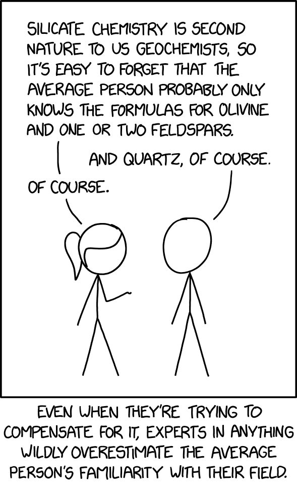 Credit: XKCD. XKCD 2501
Here is the tricky part though: A layperson is all of these. Your customers will be idiots with everchanging tastes who don’t know what they want. And you will never be able to compensate enough to look through their eyes. When a customer first look at your product, or site, or ad, or whatever it is, they have no background, no knowledge, nothing about you. You will always have biases that you cannot ignore or shut off, and that is why it is nearly impossible to pretend to be a layperson.
So then, how do you even start with trying to figure out how to design something if you can’t be a layperson? We can’t predict exactly how a layperson might behave, but we can make assumptions about how they might react to a decision. And while it’s not 100% universal, you can get a pretty good idea of Signals.
Signalling Excellence
Have you ever been strolling downtown and had to decide where to eat? Or maybe scrolling through a list of restaurants on your delivery app and wondering who to get from. Or maybe you need a new phone charger, so you hop on [large online marketplace] to purchase one. How do you make your decision?
Even the strongest defenders of “Advertising doesn’t work on me, I just look at the facts” will still fall victim to signals. Maybe that restaurant has a little too much dirt on it’s windows. Maybe that takeout place’s menu photos look a little too generic. Maybe that phone charger’s text has way too many spelling mistakes. If you spent time, you could piece together just why something gives you “good” or “bad” vibes, but everyone has “gut reactions” at some point.
Signals are learned, but that doesn’t make them totally unique. At the end of the day, it’s pretty much associative pattern matching: You learn over time what makes something “good” and what makes something “bad” and use that to short circuit a long process of decision making. That restaurant with dirt on it’s windows calls into question their attention to detail in other matters, like food preparation or kitchen safety. The generic photos on a takeout menu makes you wonder if that food is real or a stock image. The extremely poor spelling on the phone charger listing is indicative of a rushed job.
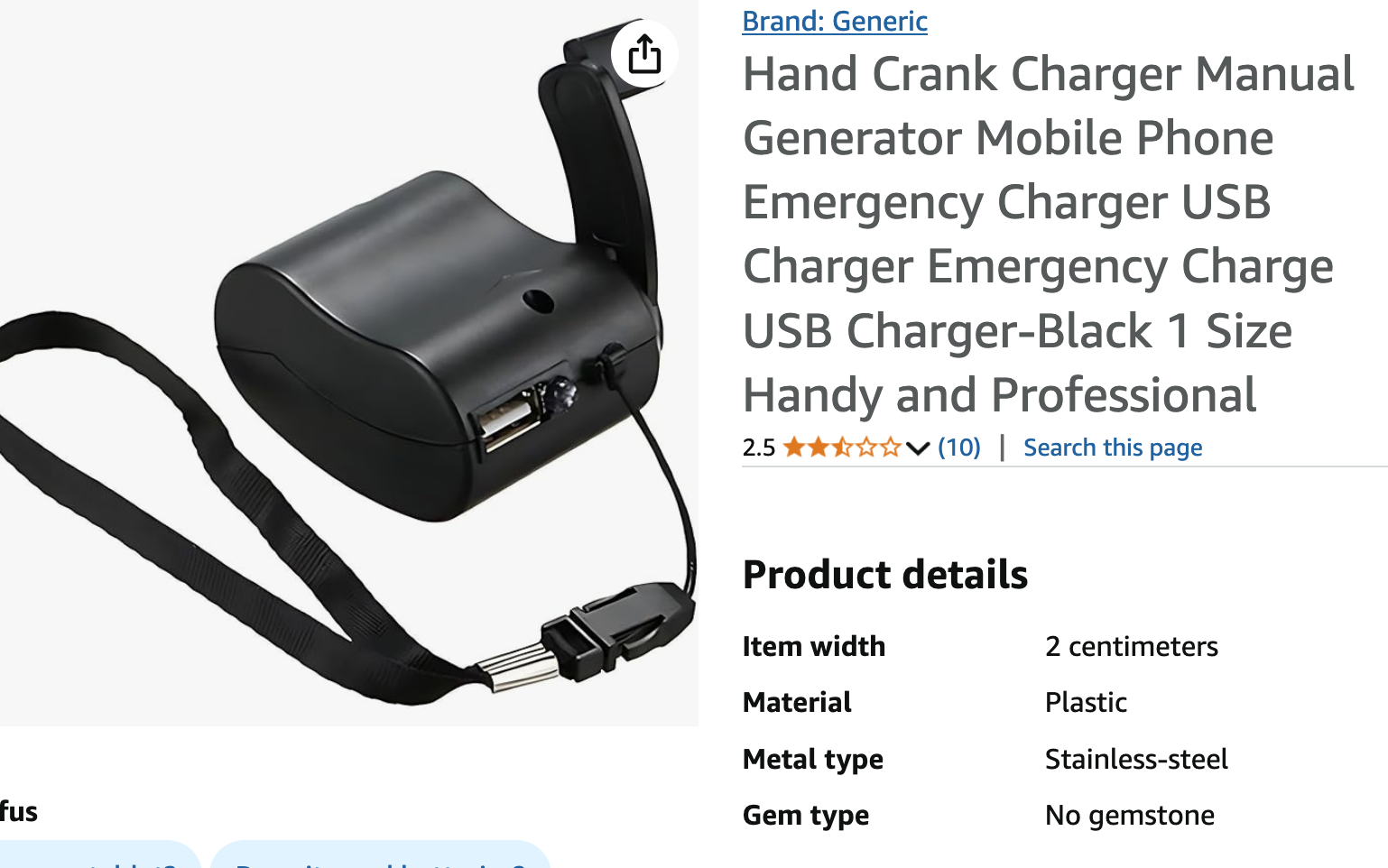 Why does my hand cranked phone charger need a gemstone field?
These signals generally come back to a root cause: Time, and quality. If someone cares about their craft, it extends into all other aspects of it as well: A restaurant that puts pride in their meals will make sure their windows are clean just as much as a manufacturer that puts hundreds of hours into making a phone charger will ensure their descriptions are written accurately.
As engineers, we want to minmax quality with cost. Aesthetics are cool to satiate our sense of beauty, but I think it is too often missed exactly what quality means. Above all else, it is a signal. It is a signal that the hours that went into the small aesthetic details pale in comparison to the hundreds of hours put into the product itself. It is a signal of a company dedicated to excellence top down, with attention to detail.
So don’t leave well enough alone. Take that extra step, that extra signal, that extra unconcious indicator that the customer should buy your product.
The point at the end of the long tangent
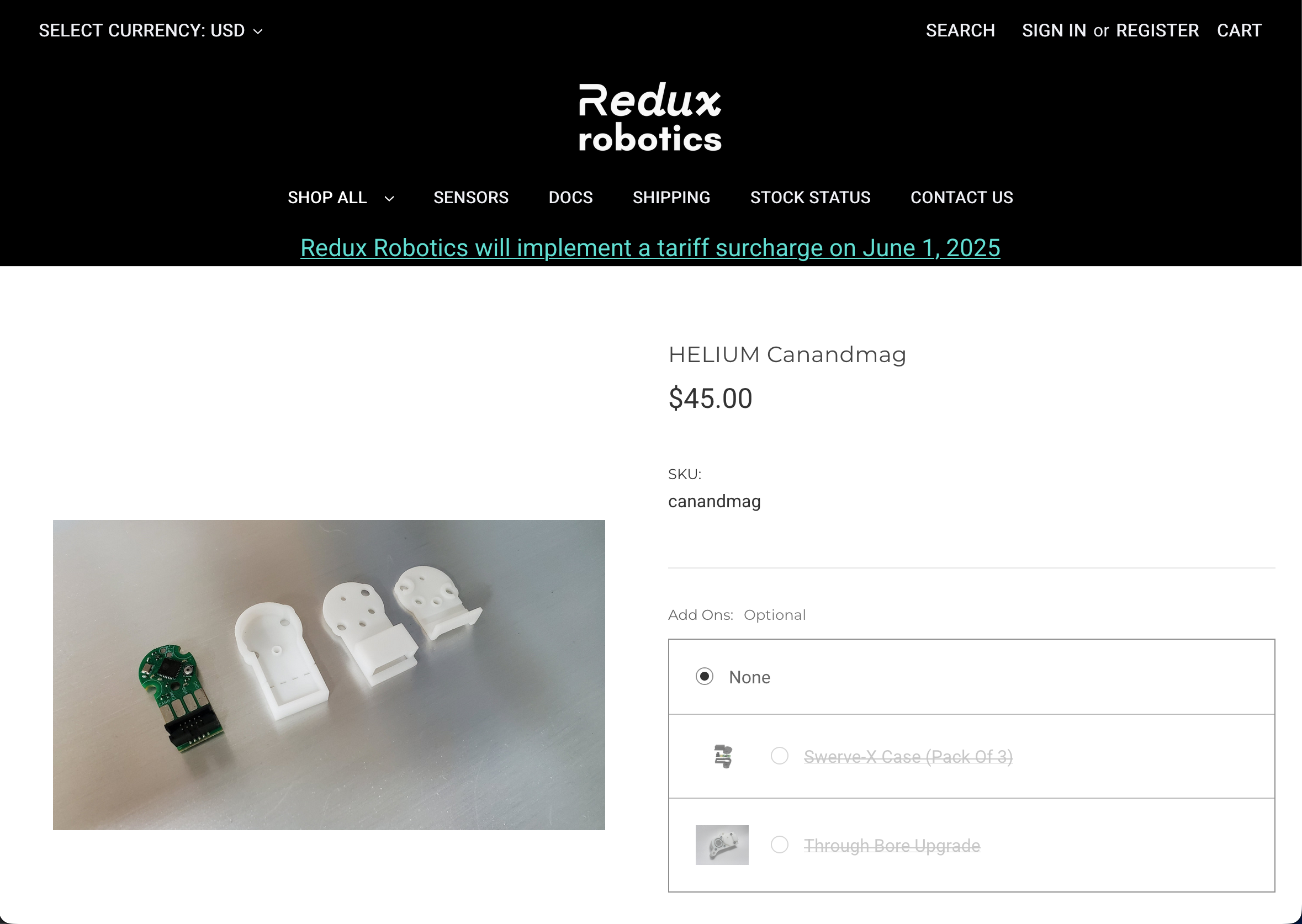
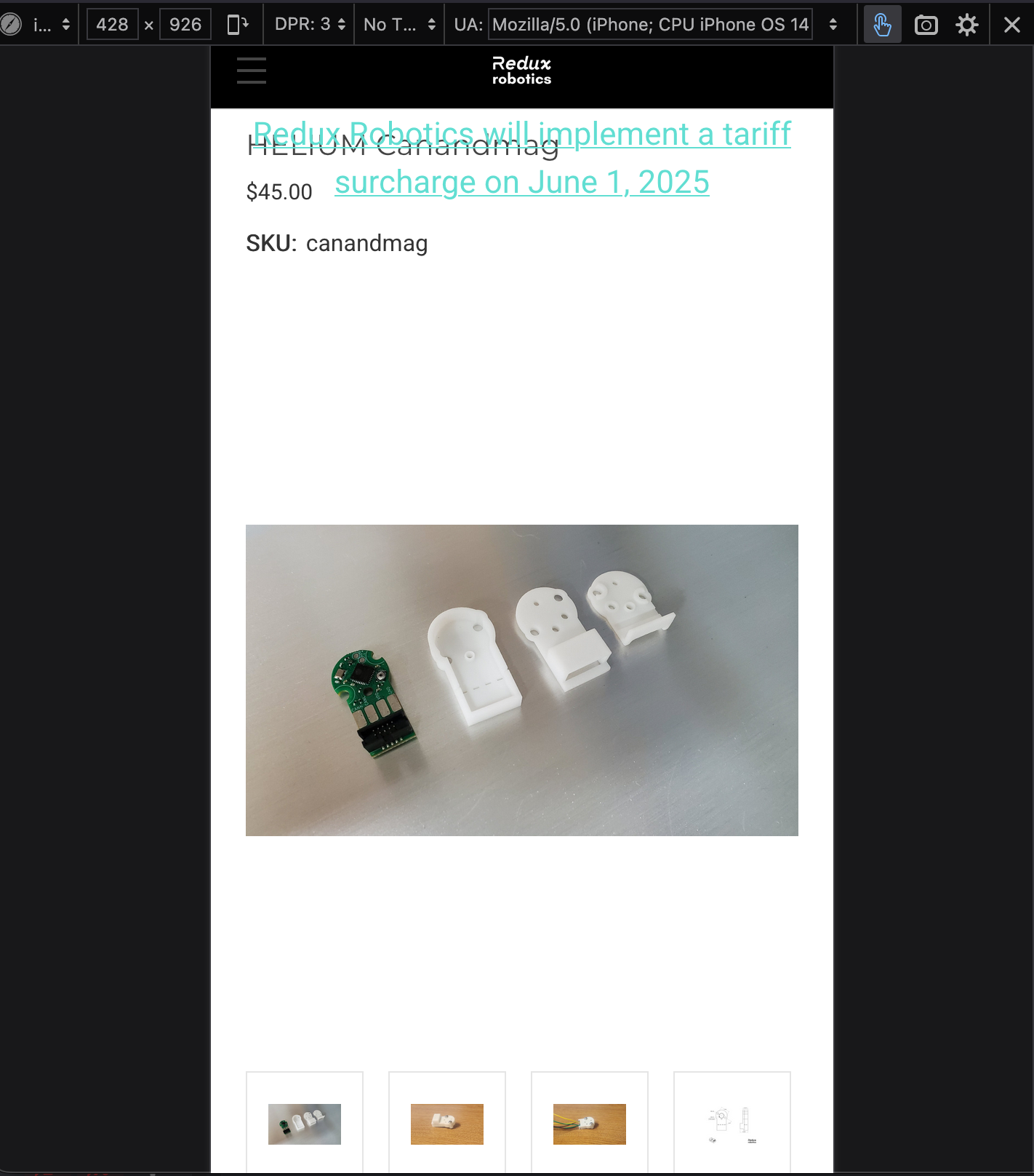
I’m not going to claim that what I have made is the end all of UX. I will not claim that I think our new site is wildly better then our old site. What I will claim though, is it is a step in the direction I wanted it to go.
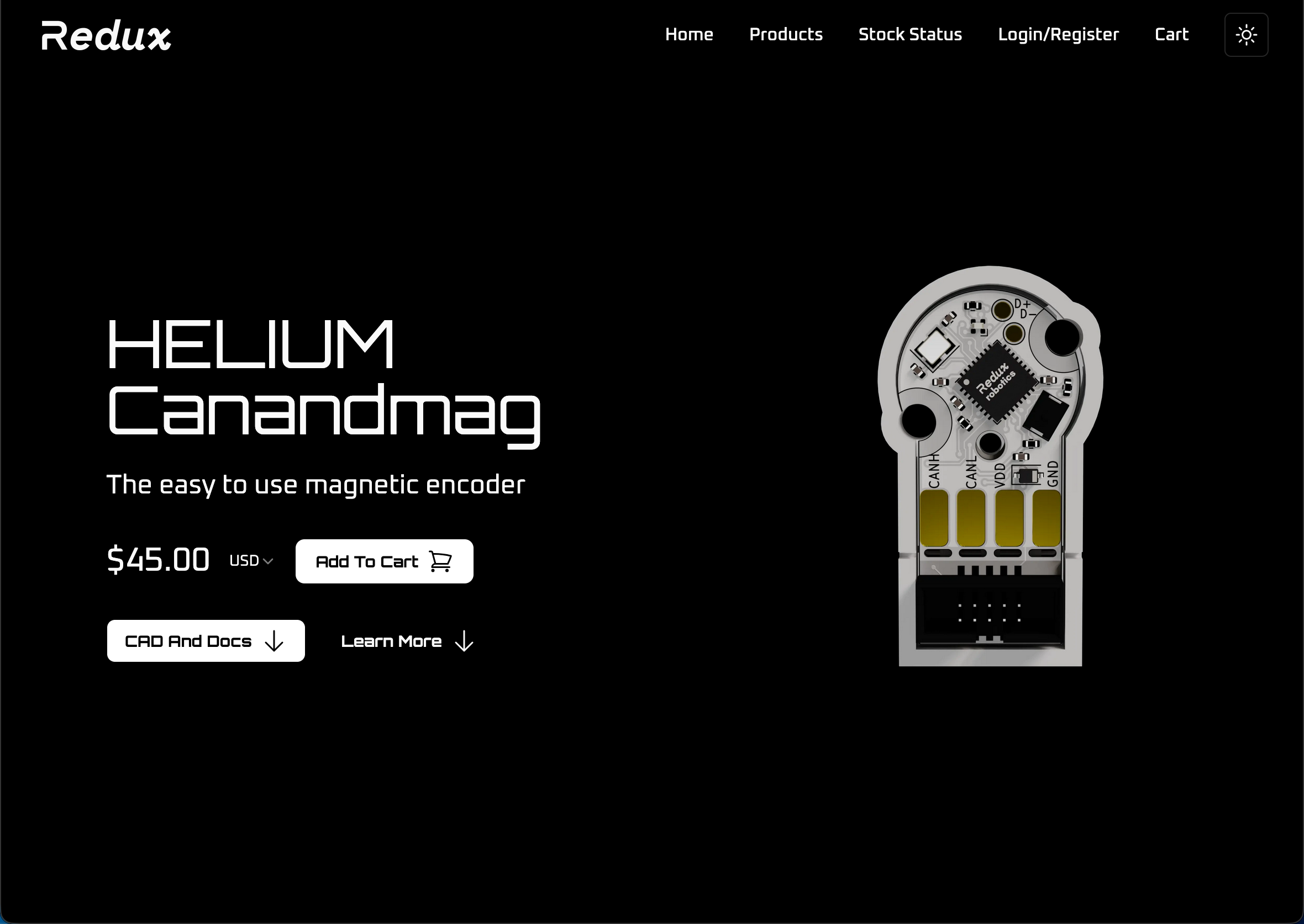 Minimalistic, but functional. I think it carries some elegance, personally
This may seem underwhelming after my rant about signals, but don’t get me wrong. Having more things is not a signal, it’s a sign of clutter. Especially now, the trend is pretty clear: Tasteful minimalism is an indication of quality moreso then having 600 specs upfront. Remember your audience, having all of the specs in one view is great for the people needing information at a glance (those more committed to buying your product).
I’ll admit, I am justifying personal aesthetic biases here. But the truth is, there is no right answer. Tasteful minimalism is just as valid a signal as well placed specification tables. It’s all about who you ask.
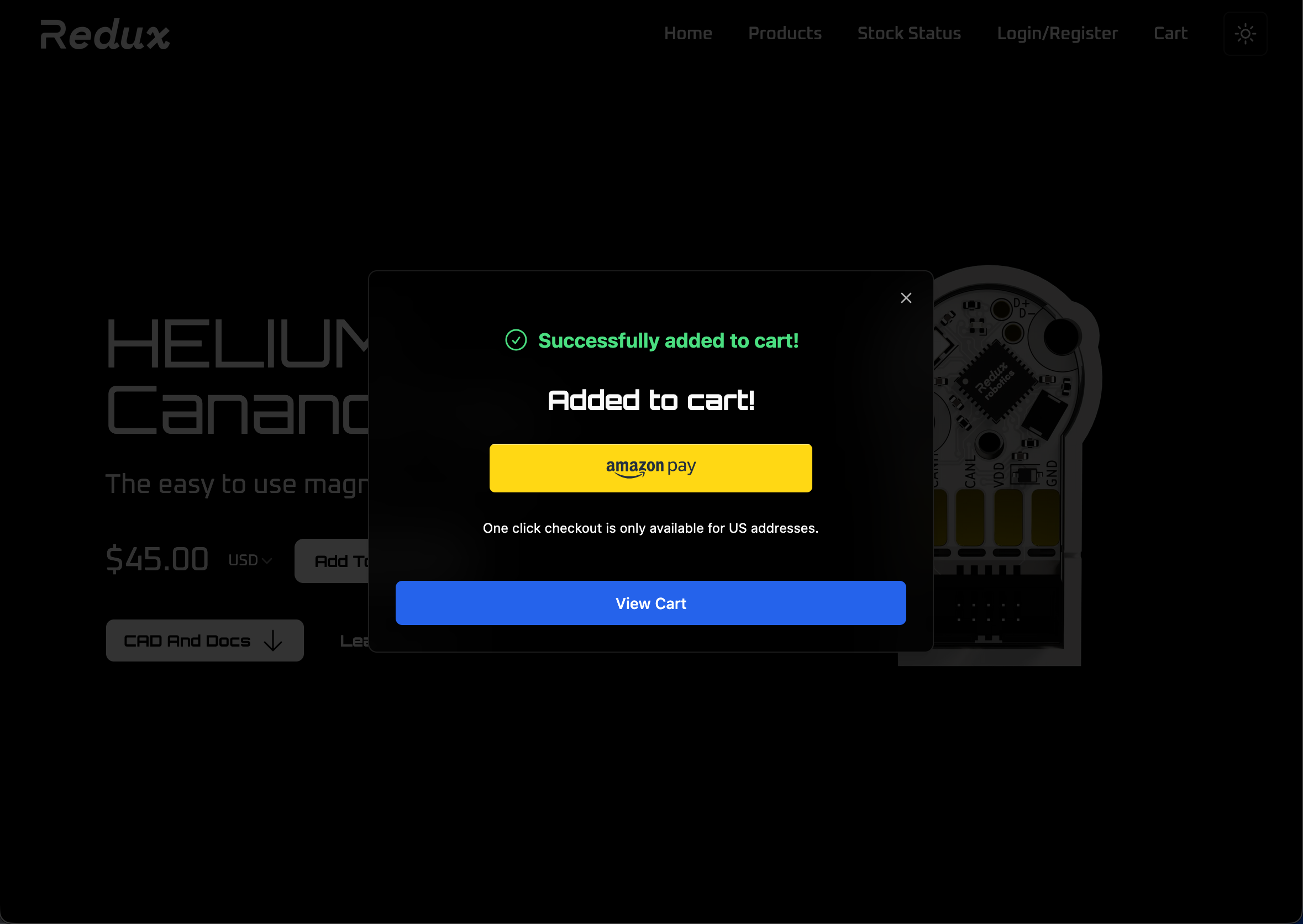
If you ask me, I think a signal of professionalism includes small details, like making checkout flows easier
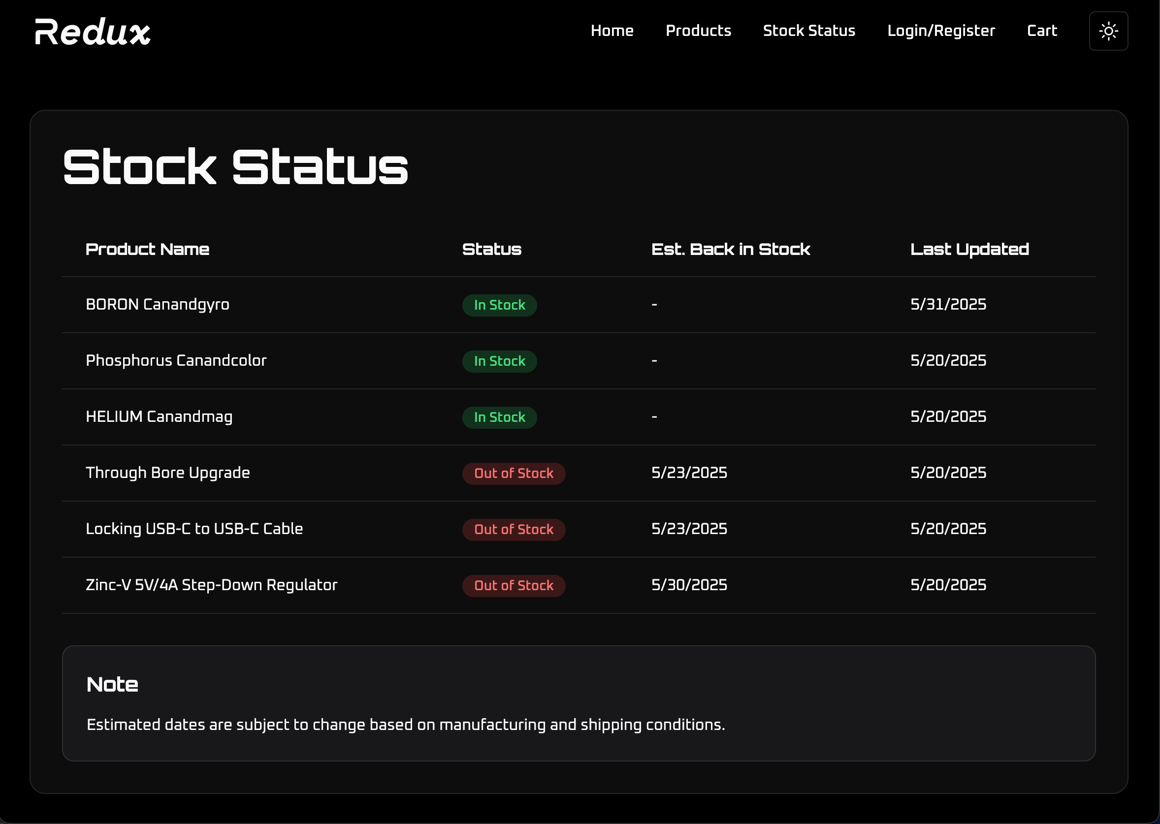
 Or comprehensive but slick back in stock tables
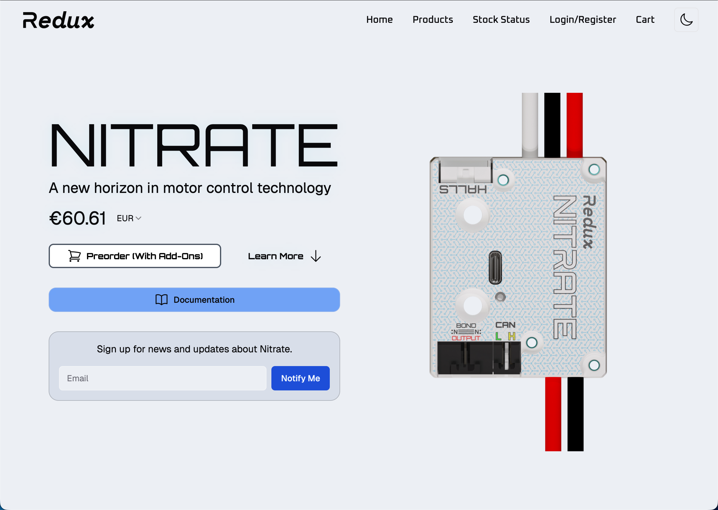
 Or even something as simple as currency conversion and site wide light/dark themeing
 As always, it is important to back up your decisions with real information. Cleaner checkout flows lead to better conversion, more comprehensive and slick back in stock tables give customers confidence to wait for your products, and themeing and currency conversion help with international sales. But what also matters, is that they are all signals that you are willing to put in the extra time for that extra bit of niceness. A signal which will translate to your product.
So the real goal for the redesign? Signal exactly what our fundamental values are to me: Elegant, it just works solutions. Products that work for you, not the other way around. All at unbeatable prices.
Stay tuned for part 1.